I’ve been thinking about covers for a while now. One of the many great debates around the ephemeralisation of music has been the lamentations for the loss of cover art: now, we are reaching the same point with books.
I say ephemeralisation rather than digitisation because it’s not just a physical transformation we’re going through, it’s a cognitive one. I’ve been repeating Walter Pater’s famous quote in my head a lot: “all art aspires to the condition of music”. Pater argued that “For while in all other works of art it is possible to distinguish the matter from the form, and the understanding can always make this distinction, yet it is the constant effort of art to obliterate it.” One way of seeing this ‘condition’ of music is that it is abstract, it is all around us, it is ever-present and always available, but intangible. Literature, cloud-based or electronically present, accessible on this or that device, encountered in differing forms and extractions, quoted and misquoted, has been separated from the physical book, with all the dissonance this implies.
Anyway. Covers.
“Don’t judge a book by its cover” has never been more true. This is not good:
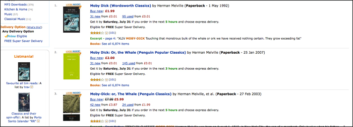
But this is the way most of us see covers now: as blurred little icons; nothing like the designer / art director / marketing dept. envisaged, and no use for their intended purpose.
This particularly sprung to mind this week with the arrival of Andrew Wylie’s Odyssey Editions, an ebook-only classics imprint designed and built by my old employer Enhanced Editions. The covers are, of course, beautiful:
The covers are typographic, and hark back in particular to the famous Pelican cover for John Berger’s Ways of Seeing, where the text starts on the front cover. But it struck me that they are not covers in any traditional sense: they have nothing to cover. They are icons. Signifiers. And more crucially, they’re not there to sell the book directly; they are marketing material separated from the point-of-sale.
Cover art only sells physical books. In an ideal world we would get rid of cover art altogether. This is probably what JD Salinger desired, in his refusal to countenance any imagery at all on his book covers (a request that continues to be honoured, notably in Hamish Hamilton and Seb Lester’s beautiful new editions).
If we’re going to continue to use “covers” as marketing material, which presumably we will as long as digital texts have physical counterparts, we need to recognise that their reproduction is out of our control: they will be copied, linked, and reposted, at different resolutions and sizes (there’s long been a muttering desire from publishers for the ability to supply Amazon with different covers for different size displays: this is one option, but not one Amazon seems happy with). We might also recognise that there are potentially many different jobs for the cover to do.
What do covers do now? They appeal aesthetically (something hard to do at 120 pixels high). They give space to blurbs and plaudits (it’s OK, we’re not space-limited any more). And they recommend (this is why all thriller covers look the same; why there is a blood-spattered crime vernacular; why every historical novel features a bodice and ruched velvet).
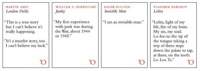
Text-based covers are one approach. Alongside Odyssey’s, I’ve long been a fan of Melville House’s novella series, and Reclam‘s uncompromising non-fiction:


This is recommendation through publisher branding: possibly the strongest icon-based approached.
But could we represent this recommendation somehow? Is there a better way? I’m not sure, but I like, for example, Stefanie Posavec and and Greg McInerny‘s “representations” of OK Go’s album “Of the Blue Colour of the Sky”, which formed that record’s cover art:

I know I’ve been talking a lot about visualisation lately, and perhaps it’s a passing thing. But it feels like we’re missing an opportunity here, before book jackets go the way of album covers. To encode some of our knowledge of books in a way that’s both attractive and useful to readers. To remake the cover in the service of the digital book. Representation and recommendation are two possible approaches. What others are there?
[…] via On covers | booktwo.org. […]
Pingback by Quick Link | On covers | booktwo.org | Eoin Purcell's Blog — July 30, 2010 @ 8:08 pm
I do a lot of book cover design, and have obviously been giving this subject a good deal of thought.
My own thinking has generally been that the “cover” is unlikely to disappear any time soon, but instead is already evolving into / merging with a one-piece marketing graphic.
And indeed, as regards the intent of the “designer / art director / marketing dept.,” I can tell you that my publishing clients have been specifically encouraging consideration of whether cover designs can work at thumbnail size.
So, while I could be wrong (and obviously want, very much, to believe that I’m not) I don’t see the book cover really vanishing any time soon, because so long as people are selling books I imagine that they’re going to need some sort of product image. Even as these products move more and more to the web, the fact is that the web is very visual; you can’t see music at all, and you can’t get an impression of music or a book at a brief glance.
Certainly, “blurred little icons” are not ideal, but that isn’t really the whole story. You click on the blurred little icon and get a (somewhat, at least) better look at the design. And books, really, are in no way unique here. In an online catalog environment (indeed, to some extent, most printed catalog environments) almost everything is going to be a blurred little icon initially.
The little icon will, I assume, continue to grow in importance among the book cover design’s various roles. But I’m not convinced that this will crowd out those other roles entirely, or really invalidate the concept of the book cover, any time soon.
(And, again, I certainly hope not.) Anyway, I appreciate your thoughtful comments here.
Comment by Matt Kuhns — August 1, 2010 @ 3:16 pm
[…] This article is interesting- http://booktwo.org/notebook/on-covers/ […]
Pingback by Cover art in the age of ebooks « Paul Jessup — August 1, 2010 @ 5:53 pm
The new Macmillan re-issues of Cormac McCarthy have also gone for the text-based cover: http://www.panmacmillan.com/displayPage.asp?PageID=7917
Comment by Dom Kippin — August 2, 2010 @ 9:01 am
I love Stefanie’s album covers, though it’s worth noting that it’s joint work between her and a colleague of mine, Greg McInerny http://research.microsoft.com/en-us/people/gregmci/
She’s also got some of her more recent traditional book covers up on her site: http://www.itsbeenreal.co.uk/index.php?/covers/assorted-book-covers/
Comment by dumbledad — August 2, 2010 @ 10:53 am
@Matt – I do agree some representation will always be around, but as ever I’m wondering if we can do better. In particular, if we can move away from some of the clichés of book design and make them useful as well as pretty. Thanks for your thoughts.
@Dom – Thank you, those are rather lovely… but look at that page – barely legible!
@Dumbledad – Duly noted and altered, thank you.
Comment by James Bridle — August 2, 2010 @ 7:28 pm
James, I hope that will prove to be the case (a way to do better). Glad if I was able to provide some worthwhile feedback… I’ll look forward to any further ideas you have on this topic.
Comment by Matt Kuhns — August 2, 2010 @ 9:10 pm
I’ve been wondering about “what books look like” a bit too. At Open Library, we’ve begun discussions with a Dutch group called Open Margin, a social marginalia system, about potential exchange. There’s certainly the idea there of displaying the position of an annotation within the context of a book. You can imagine a horizontal bar, with stripes a bit like DNA showing position of annotations.
I hope you’ve seen Stefanie Posavec’s work in this area:
http://www.itsbeenreal.co.uk/index.php?/on-going/six-editions/
Book footprints, or something…
Comment by George Oates — August 2, 2010 @ 9:52 pm
Love covers!!! I want beautiful covers for the books I’ll publish under brand new literary label MUE!
Comment by Sophie — August 6, 2010 @ 12:37 pm
Covers. I think covers still play a dominate role in our selection of reading material, people are visual animals. I thing that the problem is that online the traditional book paradigm has been shifted almost completely to the internet paradigm, where bandwidth is key.
Part of the problem lines with online retailers not adapting. Yes there should be an icon, low bandwidth users need to be accommodated. At the same time, the medium is incredibly underutilized. It needs to match resolution of the traditional book; we need access to bigger sharper cover images, and backs, all the pieces we would see in a book jacket, sample chapter.
This is minimum. As the medium evolves it needs to embrace the channel it appears in. Professional reviews (positive of course), author notes, all marketing incorporated, book signings, author appearances…and I am sure many more ideas I am not even considering. We are starting to see some of these, but not as much as could be given its potential. I am excited to see what it will become.
Thoughts from the fifth pocket.
Comment by Cory Smith — August 7, 2010 @ 4:11 am
I think of what the designer Clough Williams-Ellis said,
“Gaiety, brightness and good design are good business as well as good things in themselves.” This surely applies to book covers.
wanderingbetweentwoworlds.blogspot.com
thegoodbooksblog.blogspot.com
Comment by Anita Mathias — August 7, 2010 @ 12:07 pm
[…] la blogosphère littéraire a repris dans tous les coins cet article très intéressant (donc, à mon tour de le reprendre !) de James Birdle sur les couvertures de livres. Dans les lieux […]
Pingback by Mots et images ‹ editionsmue.com — August 9, 2010 @ 9:01 am
Just want to say that the future of books is a little sadder with the recent death of Tony Judt. Rest in peace.
Comment by Shelley — August 9, 2010 @ 10:07 pm
[…] 3rd, 2010 I’ve been thinking about covers for a while now. One of the many great debates around the ephemeralisation of music has been the […]
Pingback by On covers — August 10, 2010 @ 1:31 pm
There’s no difference between a text based image representing a book and a figurative one. Both are signifiers inviting the browser to explore further. The route you choose depends on your target market. A Melville House Art of the Novella cover doesn’t do anything essentially different from the generic Dan Brown cover. Both tell the potential purchaser the general idea of what’s inside.
I agree that with more purchases online, covers will probably become more emblematic and reductionary much like the app store icons represent software packages now. If anything, there is a real potential to develop thumbnail imagery. And why not.
Comment by Adam — August 13, 2010 @ 10:51 pm
[…] la blogosphère littéraire a très largement repris cet article de James Birdle (donc, à mon tour de le reprendre !)  sur les couvertures de livres. Dans les lieux de […]
Pingback by Mots et images ‹ M U E — August 14, 2010 @ 5:48 am
[…] Einen guten, wenn auch englischen Artikel über die Covergestaltung von eBooks gibt es hier: On Covers. […]
Pingback by Tutorial: Wie veröffentliche ich eBooks für Amazons Kindle? | Matthias Czarnetzki — August 26, 2010 @ 12:23 pm
[…] interesting Booktwo.org post on book cover design now that we mostly see book covers as “blurred little icons” on websites. Definitely […]
Pingback by Booktwo.org On Judging Books By Their Covers « 52 Projects — September 4, 2010 @ 2:40 pm
[…] Aug 1st, 2010 2:48pm On covers | booktwo.org […]
Pingback by Aug 1st, 2010 2:48pm « Mike Cane's Tumblr Evac — September 28, 2010 @ 11:55 pm