In the class at NYU, we’ve been talking a lot about projection and representation. One recent thing we keep referring back to is this Radiolab episode. You should listen to it. It’s about colour. The best story in it is how blue didn’t exist in classical language, hence Homer’s “wine-dark sea”: blue was not yet differentiated from red. This post is about green.
Green’s differentiation from other colours usually comes quite early in a language’s development, but not in all. In Japan, green as distinct from blue did not appear until the Twentieth Century, while many Turkic languages use one word for the blue of the sky, the sea, and green plants; and another for the green of man-made things. This post is about the man-made green.

It begins here, of course, in Matt’s response to the first New Aesthetic post.
“Beyonce’s bright-green chromakey socks might be the first, positive step into the real aesthetic of the early 21st century, out of the shadows of how it begun.”
Chromakey is a production technique allowing two or more image or video streams to be composited together, based on the use of particular colours. Blue and green are the most common because the most distant from human skin colours. Green backdrops are increasingly dominant, as the image sensors in digital video cameras are particularly sensitive to green. This sensitivity is due to the Bayer pattern, an attempt in turn to mimic the human eye in digital photoreception by including twice as many green photoreceptors as red and blue ones.

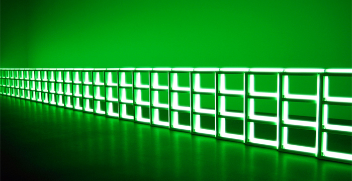
This is the green of Dan Flavin, the master of light. I can sit in front of Flavin for hours. I’ve written about light and its relevance to the network before.
I first saw Flavin’s work in quantity and with full appreciation at the Hayward retrospective in 2006. I sat in front of the grids of light with my eyes closed and his flourescent lights gave out a special heat, that of colour. The only other place I’ve felt it so strongly from an inert source was stood before Mondrian’s Dune in Zeeland at the Guggenheim.
I’ve seen Flavin many times since. I saw him last week at the Museum of Fine Arts in Boston: one of the monuments for Tatlin, just one, alone and all I needed. (We cannot build enough monuments for Tatlin.)
Flavin’s now-permanent installation at the Stedelijk in Amsterdam is composed of two complementary works: “untitled (to Piet Mondrian through his preferred colors, red, yellow and blue)” and “untitled (to Piet Mondrian who lacked green).” You ascend into the work from the ground floor of the museum and green is the colour of the heavens.

The other side of the green light, its modulation, is named for the heavens but directed the other way: not an injunction to raise ones eyes, but to smite downwards.
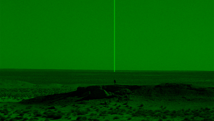
“We call it in, and we’re given all the clearances that are necessary, all the approvals and everything else, and then we do something called the Light of God – the Marines like to call it the Light of God. It’s a laser targetting marker. We just send out a beam of laser and when the troops put on their night vision goggles they’ll just see this light that looks like it’s coming from heaven. Right on the spot, coming out of nowhere, from the sky. It’s quite beautiful.”
That is a drone operator talking about targetting an IED site in Afghanistan or Iraq. It follows identification of the site by the operator using a thermal camera, and is immediately followed by a hellfire missile strike, watched by the operator as well as troops on the ground, and other military personnel in command centres, all the way up to the Pentagon. It’s a quote from Omer Fast’s extraordinary film “Five Thousand Feet is the Best” (2011, excerpt).
I couldn’t find any pictures of the Light of God, so I made the one above. Laser designation systems are invisible under normal circumstances: a technologically-augmented vision bathes the world in a green light, and makes them visible.

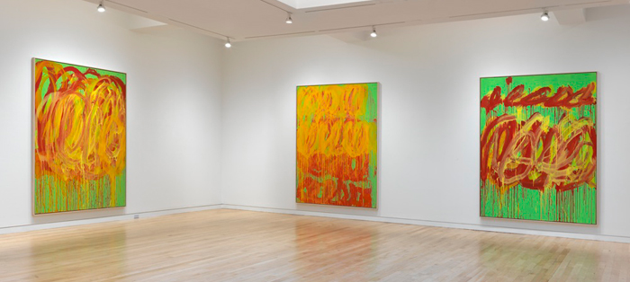
The final green, recently encountered and the spur for this post, returns us to hope, and pigmented rather than flourescent colour. Cy Twombly’s “Last Paintings” currently at the Gagosian Gallery: eight large chromakey green canvases spiralled and dripping with loops of red and yellow.
Twombly died in 2011, but these paintings are not elegiac at all; they are exuberant. A painting over of the world, which is what green represents, both verdant and chromakey, physical and digital.
A green that moves from light to pigment, from visible to invisible, from wave to particle, between motion and stillness. A radiant green, a beckoning green, a green for marking out and calling forth, a green that shifts and can be replaced and overwritten, that underlies everything.
Comments are closed. Feel free to email if you have something to say, or leave a trackback from your own site.