The subject of reading from electronic screens is a matter of ongoing debate. Many claim people will simply never read off screens in the way that they read off paper now. Excepting e-ink-based paper, which promises to revolutionise our understanding of “the screen”, are there simple ways to improve our reading experience on the web?
Despite a large amount of research in the area, there is no generally accepted ‘best’ way of reading text. Indeed, many research papers (such as this one) note that no researcher has come to a conclusive result on this. Bigger text is better, but not always aesthetically so, or when there is a large amount of information to fit onto a single page. Colour is another subject of debate: high-contrast text is good, but we seem to have inherited the traditional black-on-white that originally occurred purely to save money on ink. Such concerns are no longer relevant. There was even a period when white text on a black field could be said to be more economical (see this article) but as CRT monitors are phased out in favour of LCD, there is no argument for this either.

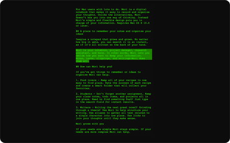
One of my favourite little applications is called Writeroom – a small OSX application that allows you to write ‘in seclusion’ by hiding everything on the screen apart from the words you’re typing (there’s also a PC version – Dark Room). The default view (shown above) is green on black, which, alongside the size and font, is completely configurable. I’ve found the default setting the best, and the easiest on the eye.
So, as an experiment, you can now read booktwo.org in such a format – just click that “Enhanced Reading Style” link in the sidebar to switch to an enlarged, green-and-black view of the main body of the page you’re looking at. To switch back, just click the whitetext button in the top right corner of the new page. Try it now. We think it will help with long articles and tired eyes.
It’s all done in CSS – you’re looking at exactly the same content, but with a different layout and colour scheme applied, via an open-source javascript stylesheet switcher. As booktwo.org is already written in fully valid XHTML and CSS, it took about half an hour to set this up. This is the kind of thing that is possible for everyone to do, and I think we’ll see more user-control of pages as the web evolves – many already allow resizing of text, color and layout are the next step.
Is it easy to use? Would you like it in more colour combinations or sizes? What other sites and applications would benefit from this? Let us know what you think.
UPDATE 21/6/07: After quite a lot of feedback, it appears people definitely prefer white on black to green on black, so have changed the enhanced reading style accordingly. I’ve also increased the line-spacing significantly. Better?
UPDATE 17/9/07: Put images back into the enhanced version. Not really sure why I took them out in the first place…
On the subject, despite the hideous name the programmer has chosen for his software company, I strongly recommend a look at Scrivener, an OS X app for writing. The only one I’ve seen worth anyone’s time, and with a very nice full-screen mode of its own.
Comment by Max — May 10, 2007 @ 11:49 pm
Oh that’s a nice one. I thought about exactly the same recently but gave up on this, because it’s not fullscreen (with larger resolutions you probably don’t have your browser maximized anymore). Still, it looks better than I thought. Maybe you should increase your line height, though.
Comment by Benjamin Wittorf — February 13, 2008 @ 7:13 pm
I really like the idea, but as with most innovative things on the web it seems to make more sense to have sites provide extra stylesheets (using ) and have _browsers_ make selecting these alternative ones easier — none of the major browsers notifies you of extra available styles currently and I think that’s a large gap in functionality.
Comment by Carl van Tonder — November 20, 2008 @ 4:36 pm